
OUra ring Personal Journey case study
Introduction
User Journey
Strengths of the Product & App
Opportunities for Improvement
Conclusion & Reflection
Introduction
This hybrid UX case study combines a personal user journey and design critique of the Oura Ring, a health tracking smart ring designed to make wellness a daily practice. This case study reflects my experience with the product by analyzing my personal user journey from initial awareness all the way to daily use.
Throughout this case study, I examine design decisions across the physical product, app interface, and onboarding flows. I highlight what worked, what could be improved, and why those choices may have been made, and apply UX design frameworks to identify successes and opportunities. Ultimately, I found the Oura Ring to be a thoughtfully designed health tool with some accessibility gaps that could be improved.
Goals of the Case Study:
Map the user journey stages of a health & wellness product
Evaluate product and app design
Highlight strengths and offer ideas for opportunities for growth
Understand and empathize with business/tech trade offs
What is the Oura Ring?
The Oura Ring is a smart health tracker developed by Oura Health Ltd., a Finnish health and technology company founded in 2013. Its mission is to “make health a daily practice” through state-of-the-art biometric data collection and provide users with recommendations to improve health and wellbeing. The sleek ring seamlessly tracks sleep, activity, readiness, heart rate variability, stress, oxygen levels, and more, all of which are visualized through the accompanying Oura app. As research and development progresses, Oura continues to integrate new features like the recent addition of fertility tracking and glucose monitoring.

Why Analyze the Oura Ring?
I chose to analyze the Oura Ring because I am a user of the product and fit into the target groups. I find it to be something beneficial to my daily life and thought it would be interesting to approach it with a designer’s lens. As previously mentioned, I have an interest in FemTech and find Oura’s recent rise in popularity to be fascinating.
I also aspire to work on a product like the Oura Ring or for a company like Oura Health Ltd. both in terms of product design and mission. This case study is an opportunity to explore the tradeoffs behind key design choices that shape the Oura experience and how ultimately those choices resonate with users and contribute to lasting success.
User Journey


Clockwise: Apple Watch, Garmin, Oura Ring, WHOOP
Awareness
📍 Targeted Ads
I started noticing Oura Ring ads in late 2024, mostly on Instagram, but didn’t explore further until a clever LinkedIn post caught my eye. A newly hired marketing employee announced she was joining Oura by mimicking a wedding engagement post. She was obviously a great hire because the post spurred me to take a closer look.
I was focused on improving my sleep, and Oura seemed like a promising tool to support that goal. The idea of passively tracking my sleep patterns and receiving personalized recommendations and the best course of action really appealed to me. Compared to bulkier, screen-based wearable tech like the Apple Watch, Garmin, or WHOOP, Oura felt like a less invasive, more stylish option I could actually see myself wearing day to day.
While new to me, Oura has been around for years and is clearly scaling its marketing and brand visibility. It feels designed for a broader, more casual audience composed of people focused on daily wellbeing rather than those optimizing health and training regiments.
Consideration
📍 Product Research
📍 Christmas List
Oura had been on my radar, but I didn’t explore the website until I added it to my 2024 Christmas list and needed a link. That was my first real product research moment.
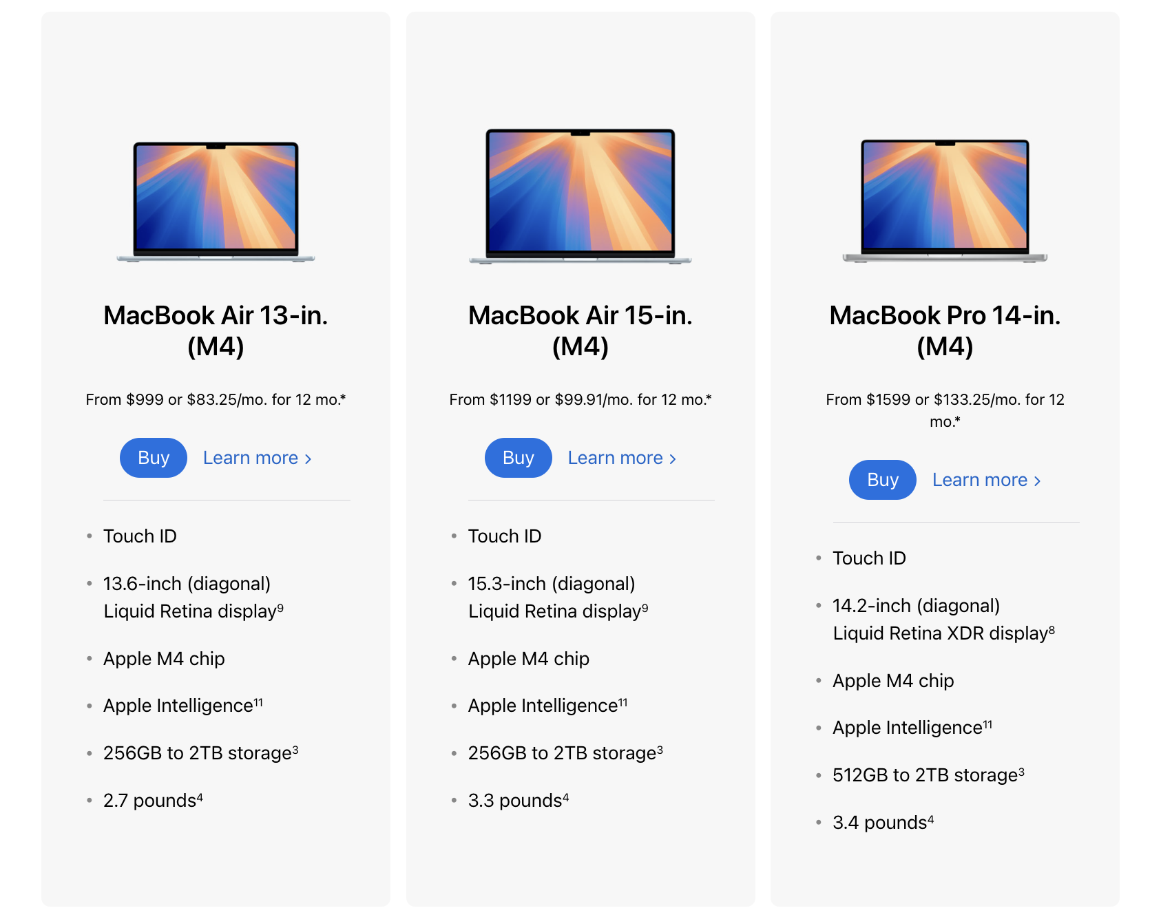
Right away, I was confused by the options. The Oura Ring 4 had just launched, but the Gen 3 was still available. While there was a clear marketing push towards the latest model, I had trouble deciphering what the difference between models was, aside from the obvious price difference, and which would be best for me. I was searching for a clear side-by-side comparison, like Apple’s MacBook lineup breakdown, but couldn’t find anything like it.
At the time, these were the key things I wanted to know:
Battery life
Design differences
Sizing specs
Feature upgrades
Data collection accuracy

While reviewing materials for this case study, I found that Oura has since added a comparison chart between Gen 3 and 4. I think this is a step in the right direction, but still not as effective as it could be. The diagram was buried at the bottom of the page, easy to miss and tucked away like an afterthought. I’m guessing this is probably more on the marketing side to push for the newest model. The product illustrations, which match the brand guidelines, don’t show users what they are actually buying. Product photos would provide more tangible context.
As I perused the website, what stood out to me was how much the ring was capable of. Yet, the website experience didn’t quite match up to that. There was a plethora of impressive information, but I felt overwhelmed. That was the only meaningful time I spent on the website. I actually turned to Reddit to find more helpful info and real users gave me insight into the longer battery life in 4 vs. Gen 3.
Oura is clearly a smart product and company, but when it came to finding valuable information regarding the product, I quickly moved away from their website, which should not be the case for a potential customer. There was a disconnect between how sophisticated the product is and how hard it was to get clear answers.
Onboarding: Sizing & Sign Up
📍 Gifted Oura Ring
📍 Sizing
📍 Receiving Ring and Onboarding

Santa did indeed bring me an Oura Ring for Christmas! The first step was selecting the right size using the Oura sizing kit. The kit included a variety of sizes from 4-15, which was inclusive, but also felt unnecessarily wasteful. Oura uses their own ring measuring system instead of the traditional ring system. To reduce waste, Oura could offer a reusable sizing kit return program and maybe even add a discount to incentivize users to participate.
One thing I did appreciate was the emphasis on taking the time to find a comfortable fit. This is a big purchase and something that’s intended to be on you at all times, so it better be comfortable! The pointer and middle fingers were the suggested fingers for accurate data collection. After a short moment of panic thinking I’d gotten a ring stuck, I wore the right size for 24 hours before confirming I needed a size 7 ring. That trial period gave me confidence in the fit.
I received the ring quickly which only fueled my excitement to get going on my goals. Next up was the app setup and onboarding process. The app and profile making were intuitive. Oura asks the classic basics of age, weight, height, sex assigned at birth, to take into consideration when suggesting recommendations. I took note of the UX language surrounding sex for more inclusivity. I think they could potentially take it a step further by adding an info icon next to that section for individuals curious as to why this data matters in their health recommendations.
Before jumping into the nitty gritty, Oura asks what the user’s current goal is with options being broad, how’s your sleep at the moment, things affecting my sleep to further gather the qualitative health picture.
First Use & Establishing My Baseline

📍 Establish My Personal Baseline
To make the most accurate recommendations, Oura takes about two weeks to understand your unique patterns and establish a baseline. As I would go about my day to day, I took time to familiarize myself with the interface.
There is a lot of data. I felt overwhelmed. I don’t feel like the initial onboarding prepared me for how to use the app effectively. Offering clearer onboarding around interpreting key metrics and navigation is one area Oura could improve.
The home screen is organized around three core scores (Readiness, Sleep, and Activity, along with supplemental data features like Cycle Day or Heart Rate. I appreciate that daily metrics are highlighted at the top, easy to glance at and take stock. I think it makes everything more accessible as it prioritizes the user’s daily goals.
The app breaks out into three main sections beneath this:

Checking in
• Day to day metrics. Includes Activity Goals, Stress, and Heart Rate distinguished as color-coded boards. More button expands to reveal extra data trends.
• Out of all the sections, this is the most pertinent to the user experience. It offers the clearest insights into the daily goal.
• I noticed the Activity board features a background image of a crashing wave while other sections use a gradient. The gradients are easier to read, and I’d be curious to know the reasoning behind the visual inconsistency.

Timeline
• Timeline is the trend tracker. Area to log key moments such as waking up, consuming caffeine, or working out.
• I understand the intention behind the timeline, I think it falls short being featured on the homepage, taking up critical space. This seems better suited as a menu item. The user is already aware of most of these events.
• Deeper insights collected over multiple timelines would be more interesting and useful to detect impacting trends.

What’s new
• Oura’s marketing and business push. Oura’s latest blog posts or product announcements, inviting users to dig deeper into a highlighted topic.
• This section seems like more of a marketing feature than a useful tool. It’s a far scroll down and often the topics don’t feel relevant to my daily goals.
• I’d rather see tailored content. If someone is focused on sleep as a goal, sharing an article on how to improve sleep latency would be apt. Some topics don’t apply to every user.

Aside from the main home page, the sandwich menu that slides out is overwhelming. There are fifteen options to choose from and it takes an effort to navigate.
The bottom line: there is a lot. I feel like I might not be getting the most out of it because I don’t know the capabilities of each feature, but I simultaneously find it intimidating to dive into each part.
Visual Design Notes
The app is only available in dark mode. I found this surprising and a tad frustrating as I sometimes find the white text on the black background a little tough to digest. It honestly makes me want to open the app less. I would be interested in the justification to go this route since it impacts accessibility and readability.
Section boards nearly touch the edges of the screen. This creates a cluttered feel and disrupts the visual balance.
Typography is consistent in font, but uses variation in opacity, weight, and size. In some scenarios it creates hierarchy, in others, it creates confusion for which information is the most important at a glance.
Continued Use
📍 Using the App
Integrating Oura into my daily life has been easy. I am not glued to my app, nor would I want to be, but I have developed the habit of guessing my sleep score. I enabled notifications for charging and movement reminders which I find helpful.
The biggest takeaway I could do without is the Timeline. I already know when I slept, exercised, drank coffee, and I never refer back to previous timeline logs. Having it anchored on the homepage takes up valuable space, and for someone like me, adds some unnecessary scrolling.
What’s working:
Daily check-ins feel intuitive and helpful
Habit formation is happening naturally
Notifications support subtle behavior change
What’s overwhelming:
Too many items in the menu
Lack of guidance on advanced features
Unclear visual hierarchy makes the app feel more complex than it needs to be
Strengths of the Product & App
The Oura Ring is nothing short of spectacular. Its greatest strength is its ability for data collection while being housed in a wearable product. The small, functional ring fits seamlessly into daily life, making it easy for users to integrate into their routines. The breadth of data the Oura Ring is able to collect and consolidate into insights via the app provides users with one of the most holistic glimpses into their health. Specific strengths I took note of:

Customizable Views
I was struck by the ability to turn on or off particular features, specifically the option to hide calories. Health baselines stem from basic biometrics like height and weight to add context for someone’s overall health profile. Though improved, most modern health apps still emphasize weight loss, often accompanied by the dreaded calorie counter. Calories are a source of pain and massive trigger for eating disorders. Being prompted with a calorie tracking question, then offered alternatives like step count, signaled to me that great consideration went into design thinking and broader user needs.

Progress Visualizations
Good visualization deserves praise! Though small details, the battery indicator and goal progress visuals are two of the most important items for me. The Oura ring has a great battery life, so good that I forget it even needs to charge. A circle icon in the upper right corner represents the battery and gradually becomes unfilled as the ring loses charge. Percentages would also make sense here, but it would be data overload with how many other numbers and text appear. Color indicators, yellow at 30% and red at 20%, help me quickly identify how low the battery is.
Similarly, my daily activity goal appears as a half moon like a gas tank indicator. Throughout the day when the app is opened, this level is the first thing you see, centered on the screen. It’s clearly prioritized, establishing a strong visual hierarchy.
Quick, at-a-glance summaries reduce cognitive load. Paired with notifications, they help me stay on track and working towards my goals.

Motivational Gamification
As we know, humans are creatures who thrive on positive feedback loops. Reward systems consistently demonstrate their power to drive behavior change. Oura employs their version by rewarding a score of 85 or above with a crown for the core areas (Readiness, Sleep, and Activity). The goal is to earn three crowns each day. Once I understood the crown system (thanks, Reddit!), it motivated me to strive for crown streaks and create a little competition with myself.

Integration with Other Apps
Oura integrates smoothly with other apps. Starting over with a new health app or remembering to track activity in multiple places can be daunting. The integration capabilities with other wellness apps keep me primarily on Oura. From a business perspective, the more time users spend within a product and not using a competitor’s the better.
As a user, it’s great to not toggle between multiple apps. Thanks to the wide breadth of data collection, Oura supports integrations with period cycle tracking, fertility windows & family planning, and new additions like glucose monitoring through Oura’s recent Dexcom partnership.
Opportunities for Improvement
As with any great feat, there always trade-offs. On the flip side of the data collection coin is that the sheer volume of information can be overwhelming. Below are my suggestions, listed in order of priority:
Provide Light Mode for Accessibility
The all-dark UI can strain the eyes during early morning or late-night use. After a little digging, it seems that Oura may be considering adding a light mode feature. Even having an adaptive brightness setting could help. Without this, I think Oura could be alienating potential users or frustrating current users and making them averse to the app. A light mode or adjustable display may extend time spent in-app and make it easier for users to locate information.
Streamline the App Interface with Customizable Visual Elements
The current menu structure feels cluttered with extraneous details that may or may not pertain to users. A customizable toggle board similar to Apple’s widget screen or the Garmin app can empower the user experience. Allowing users to pin their main goal(s) would prioritize what matters, while collapsing or removing low-priority items would keep the interface focused and personalized.

Apple Widget

Garmin Toggle Board
Deliver Actionable Insights from Data Reports
This may be more of a stretch since it’s veering into medical territory, but it’s worth noting that the vast amounts of data are not actionable on their own. Creating more room for nuance in the data could help users change patterns. Maybe a “What to do next” suggestion based on the current data and the user’s goals could help spark change. Streamlining dense data reports to highlight key insights at a glance, while still offering the option to dig deeper, would also improve usability.
Add a Travel Mode Feature
A feature I came up with while conducting this case study is a Travel Mode or Jet Lag Mode that triggers the app to adjust to time zones and provide travel-related recovery recommendations. While traveling abroad, I experienced data gaps and sleep prompts at 8:30 AM after returning home.
As data driven as Oura is, this seems like an oversight given the emphasis on recovery. Adding time zone shifting recommendations, similar to apps like Timeshifter, to help avoid jet lag and prepare travelers ahead of their flight could make time changes more seamless. Having this feature would be incredible and align with the mission of maintaining health.
Conclusion & Reflection
Through this case study I came to appreciate the difficulty of balancing design with functionality and business. Design is compromise. Creating a seamless wearable experience like Oura likely involves significant engineering constraints. Prioritizing battery life, tiny sensors, accurate data collection, functional wearability, hardware, and the user experience is a huge feat. Many choices clearly go through extensive research and debate and have a reason for being the way they are. Beyond that, some features may just be lower on the backlog, deprioritized to accelerate new features or refine the Oura offerings to stay within their brand. This was a great practice to pause and think about the potential reasoning behind choices while also dreaming up opportunities to make Oura even more competitive and successful.
It also challenged me to stay aware of my own bias. I chose Oura because I am part of the user group. While that gave me useful insight, I had to keep reminding myself that I am not the only user. My singular experience is important and overlaps with others, but holding that awareness was crucial to this whole project. I don’t love the Timeline, but other people may. It forced me to think bigger than just myself and led me to the idea of customizable widget boards.
Lastly, this project gave me more appreciation for how UX sits at the intersection of marketing and product. The assessment proved to me how these aspects are integrated together and collaboration must occur across these cross-functional teams.
If I were to do this project again, I’d spend more time upfront creating a clear project management plan. As my first UX project, the process was unstructured at times. I was trying to figure out how much and what to include while balancing a full-time job. The project ended up taking me about five months, which is longer than I expected. In the future, I’d break down goals and tasks to weekly milestones so I could dive in each day without losing time deciding what to do next.
UX Wins:
Sleek, wearable, easy to integrate into daily wear while still getting valuable data.
Strong habit loop with daily check-ins.
Clear personalization goals at setup.
UX Gaps:
Poor visibility of product differences pre-purchase.
Overwhelming menu structure.
App lacks light mode, making it less accessible.
Onboarding doesn’t prep user for data complexity.